Over the years I have seen, used and created a lot of email newsletters and sign up forms. At Joomlashack I was able to use strategies that grew our email list to over 350,000. At Compass Designs over 70,000 people were interested enough to sign up. At this point, I am cynical, I’ll see through the usual email bait in a heart beat. But here is one that really caught my eye, and easily made me sign up.
In the last few weeks, I have been doing research on the in’s and out’s of an apparel start-up. I have an idea that I have been toying with and wanted to expand my non-existent expertise. Pretty easy to do when you are starting from ground zero! My current stage is developing a pattern (used to create the garment) and a prototype. Turns out Adobe Illustrator is the industry standard here. I came across a website illustratorstuff.com that sells Illustrator templates, that is, editable pictures of common garments. Their sign up for an email list was nothing short of brilliant.
 The first step was nothing too unusual, the old “I’ll give you something for free if you give me your email”.
In this case it was free examples of some of these Illustrator templates called “Flats”. So far we have a good (but not groundbreaking) sign up example:
- Emphasis on the word free with color highlight.
- Nice image of the flat (even though it is digital), gives the sense you are getting “something”.
- Some reassuring language in a friendly tone “Yep, totally free”.
- Probably at this point all I might add is “Don’t worry, we won’t spam your email” or suchlike.
At this point I sign up. It happens to be exactly what I am looking for so the “ask” is not a difficult one.
An important thing to consider, however, is the signup is only half of the journey. Most email marketing platforms require a double opt in. They send an email asking you to confirm your subscription. This means any email sign up needs to be successful in getting you to click twice.
This is where illustratorstuff.com got clever.
The email I received looked like this:

I easily recognize this as coming from Mailchimp, I use it myself. Mailchimp does not let you edit the layout of this specific email very much. Here is a screenshot of my version. I don’t think I have changed the template at all. That’s pretty lazy of me and it’s probably costing me subscribers.

There are three things that illustratorstuff.com have done really well here.
- They have changed the call to action to “click the button below to get instant access”. That’s some pretty good copy. It is reminding me of why I signed up (getting the access) and adds some urgency with “instant”.
- Again they have the image that creates a sense of a physical object where there really isn’t one. It’s a digital Illustrator template.
- The third is the clever part. They change the text of the button from “Yes, subscribe me to this list” to “Yes, I want the free fashion flats now”. This is a doubling down on the call to action above, and more importantly because it is on the button it’s making the user focus on that text as they interact with the button.
The takeaway here is that you should always replace button text to create compelling calls to action. Being on an interactive button will make them more effective than just text.
Let’s move along.
Clicking the link engages standard Mailchimp mechanics, you get sent to a landing page – illustratorstuff.us5.list-manage.com. We know it’s Mailchimp because of that domain.

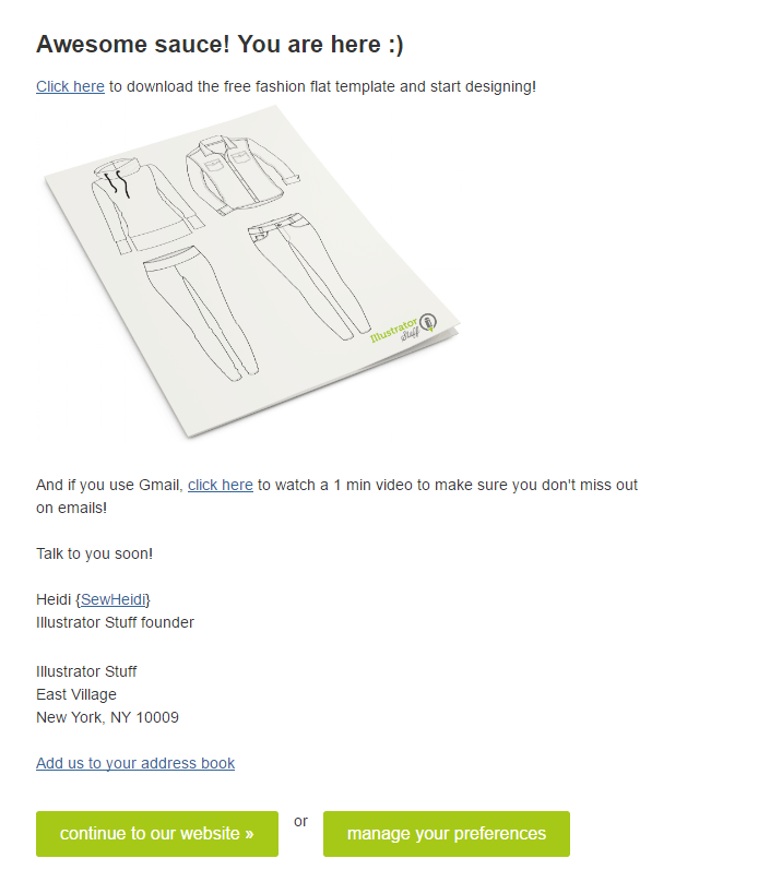
The trend continues with a very strong landing page:
- The continuing friendly tone “Awesome sauce! You are here :)”. The actual tone is not important, but the fact that the tone is consistent is.
- The download link, making sure what we came here for is early in the page. You don’t want to frustrate users. Also a nice encouragement to “start designing”.
- Again we see the image and note also the consistent color of the buttons. They have been the same at all three stages. This consistency goes a long way to assuring the user and making them more comfortable with the process.
- The video is an important addition, it will help the deliverability to the subscriber’s inbox, that is if they follow the steps. Few will of course, but anything we can do in this area is a bonus.
- Last we have a signature line from Heidi. Here we see another link to a different product of hers.
When we put everything together, this is a great model for how to increase your email newsletter signups. The sticky flow, the consistency of color and images and most importantly, the great call to action copy. Illustratorstuff.com has done a very good job at making sure their conversion rate is as high as possible.
Now I’ll sit back and see if the impending autoresponder is as good. I’ll let you know!
PS
Got any other email newsletter signup tips? Leave them in the comments.
PPS
If you want stuff like this in your inbox, use the ‘ol form on the right!
